Logo Design: ARMADA - Taste of Ink
Logo Design
Introduction
Welcome to Fructify Marketing, where we are passionate about creating exceptional logo designs that leave a lasting impression. In this article, we present you with our latest masterpiece - the ARMADA logo designed by Taste of Ink. Let's delve into the intricate details, conceptualization, and artistic journey that brought this captivating logo to life.
The Concept
Every logo carries a story, and the ARMADA logo is no exception. Our design team at Taste of Ink sought to capture the essence of strength, innovation, and unity within this powerful logo. Inspired by the naval significance of the term "armada," we set out to create a visual representation that would resonate with our client's brand identity.
Creation Process
A great logo requires meticulous planning, creativity, and attention to detail. Our team of talented designers embarked on an immersive journey to craft the perfect logo for ARMADA. Here's an insight into the creative process:
- Research and Discovery: We delved deep into the understanding of our client's industry, target audience, and unique positioning. This research paved the way for a design that resonated with ARMADA's core values.
- Brainstorming and Ideation: Armed with insights, our designers conceptualized various ideas and explored different visual elements that could portray the brand's identity effectively.
- Sketching and Drafting: From rough sketches to refined drafts, our designers translated their ideas into tangible visuals, playing with shapes, lines, and symbols that would evoke the desired emotions.
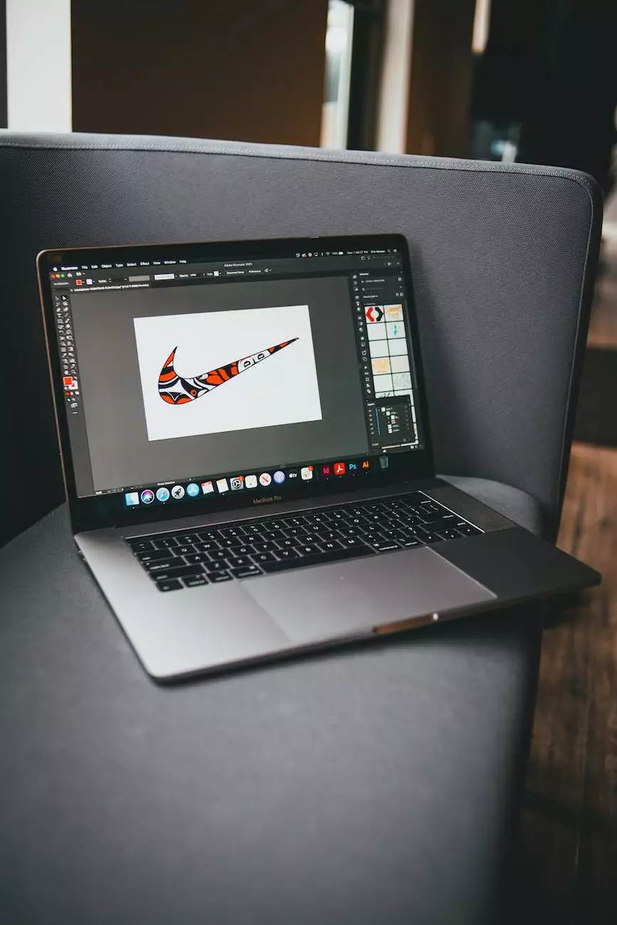
- Digital Rendering: Utilizing the latest design tools and technologies, we brought the chosen concept to life digitally. This stage allowed us to experiment with colors, typography, and visual effects, refining the logo's aesthetics.
- Feedback and Iteration: Collaboration with our client played a crucial role in shaping the logo. We carefully considered their feedback, making necessary adjustments to ensure the final product exceeded their expectations.
- Delivery and Brand Integration: Once the logo design was perfected, we provided our client with the necessary file formats and guidelines to seamlessly integrate the logo across various mediums, ensuring brand consistency and recognition.
Design Elements
The ARMADA logo encompasses several key design elements, each contributing to its overall impact:
- Symbolism: The logo incorporates elements symbolizing strength, determination, and unity – qualities strongly associated with an armada. These symbols evoke a sense of pride, trust, and reliability, making the logo instantly recognizable.
- Typography: The chosen typography reflects the brand's personality, complementing the symbol's design. Clean lines and a modern font were selected to convey professionalism, while maintaining a contemporary appeal.
- Color Palette: The color palette used in the ARMADA logo is strategic, combining bold and sophisticated hues. Each color was carefully chosen to enhance the visual impact and evoke the desired emotional response from the audience.
- Balance and Composition: The logo's design demonstrates a harmonious balance between all its elements, ensuring a visually pleasing and memorable representation of the brand. The composition aligns with established design principles, capturing attention effortlessly.
Inspiration
Every great design draws inspiration from various sources. For the ARMADA logo, our designers sought inspiration from the remarkable history of naval expeditions, legendary voyages, and the indomitable spirit of explorers. The merging of historical references and modern design elements resulted in a logo that encapsulates tradition and innovation.
The Impact of ARMADA Logo
With the ARMADA logo, Taste of Ink and Fructify Marketing aimed to create a design that would resonate deeply with the target audience and leave a lasting impression. The impact of a well-crafted logo extends beyond aesthetics; it establishes a memorable brand presence, builds trust, and differentiates a business from its competitors. The ARMADA logo has successfully achieved these objectives, becoming synonymous with strength, reliability, and advancement.
Conclusion
The ARMADA logo stands as a testament to the power of exceptional logo design. It embodies the core values of the brand it represents, visually communicates its unique attributes, and establishes a recognized visual identity. Together, Taste of Ink and Fructify Marketing have created a logo that excels not only in its aesthetic details but also in its ability to captivate and connect with the target audience.


